
This branding project was created for Hoda, a business owner seeking a look that was both elegant and distinctive. While many abaya shops rely on simple serif fonts, we developed a brand identity that balances sophistication with creativity. The result is a visual style that stands out in the market while reflecting Hoda’s unique vision and refined taste.
The branding process began with sketches and exploring different layouts, experimenting with font styles to strike the perfect balance between elegance and subtle playfulness. I considered various typefaces that could feel refined yet approachable, avoiding anything too whimsical. Once the ideal font direction was established, I created three distinct logo concepts, ultimately selecting the second version as the final design for its versatility and visual appeal.
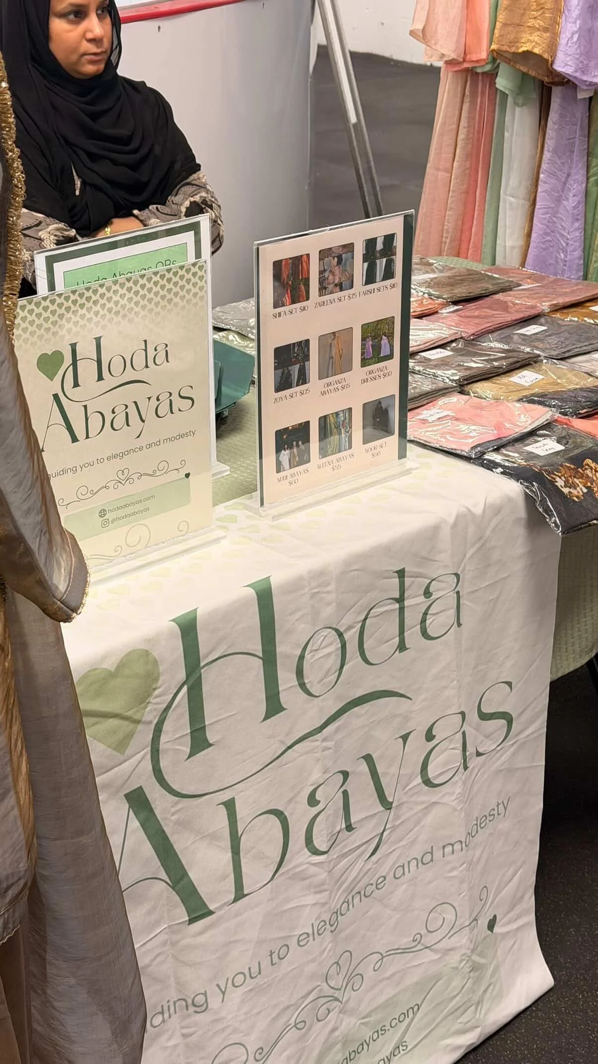
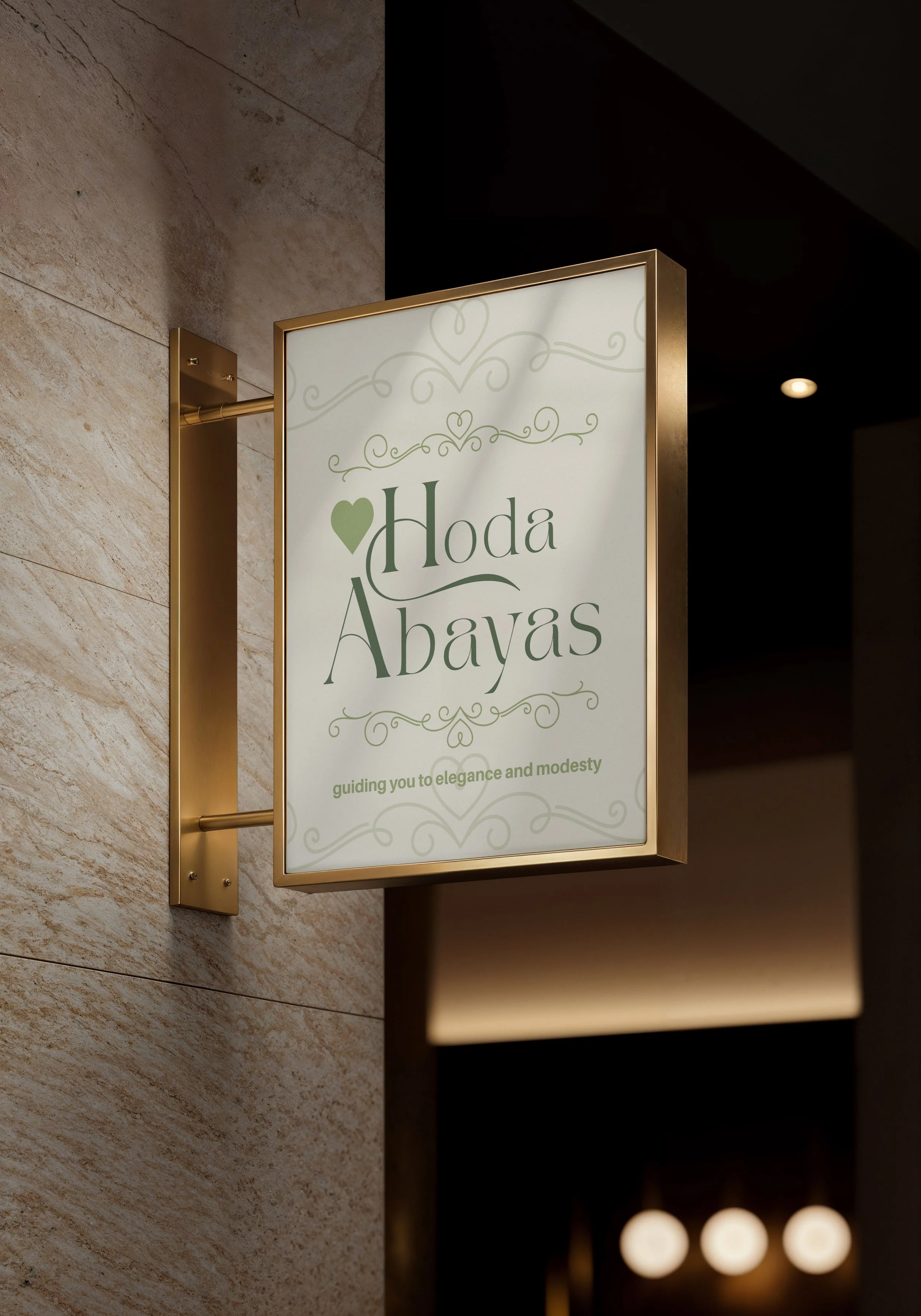
The primary logo was carefully refined with a harmonious color palette and includes a unique icon that can be used independently in smaller applications. Multiple color variations were tested to ensure flexibility across different mediums while maintaining brand consistency. The design reflects the sophisticated yet standout identity Hoda envisioned for her business.
The brand’s color palette centers on a calming sage green, Hoda’s preferred signature color, paired with a bright, pastel accent for visual impact. Complementing the colors, a curated type kit ensures consistency across all communications, while a subtle pattern adds depth and texture to branded materials. Together, these elements create a cohesive and memorable visual identity that feels fresh, elegant, and eye-catching.
Packaging
Real World Application